
Rosey Cricket Branding & Web Project
Brand identity and Website for an artisan dice studio blending storytelling, whimsy, and craftsmanship.
Website Design & Build
Overview:
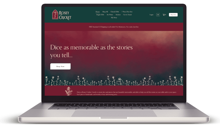
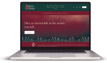
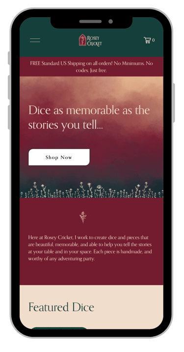
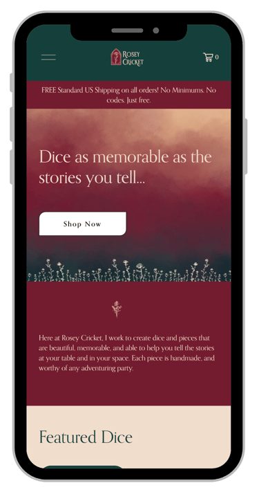
Rosey Cricket's website was designed to reflect a love of story and craft, while also allowing for easy updates to display ever-changing products and specials.
Web Goals:
Bring Rosey Cricket's Brand Identity into a website suitable for online sales
Make products easy to browse, while keeping a warm and story-centric experience.
The Build:
Rosey Cricket's website was built using Squarespace in order to make it easy to maintain and create new listing, specials, and take orders easily. Rosey Cricket's branding is present across all elements of the site, including in color styles, announcement bars, and front page features.
Overview:
Design Goals:
Rosey Cricket is an artisan dice studio inspired by the dramatic power of storytelling, the joy of gaming with others, and the tactile beauty of handcrafted pieces. The brand identity was designed to reflect a sense of storybook imagination and whimsy, while emphasizing the artist's dedication to craftsmanship and thoughtful, high-touch design.
Tagline: "For Dice as memorable as the stories you tell".
Capture a sense of beauty, wonder, and storytelling - evoking the feeling of old tales filled with exploration and adventure
Convey a strong sense of place - as if the Rosey Cricket could be a fantasy world pub or a gathering place for adventures to begin
Create a flexible visual system that could extend beyond dicemaking to other artistic pursuits
Retain rose iconography as a key brand element
Develop a rich, sophisticated color palette that remains approachable for a high-end artisan product
Balance whimsy and refinement, reflecting the tactile, handcrafted nature of the art
Design Solution:
The Rosey Cricket identity draws inspiration from storybook elements, balancing whimsy with sophistication. Architectural motifs inspired by cathedral windows create a sense of space and time, giving the identity a structured and enduring presence, grounded in environments meant to inspire awe and imagination. Intentional hand-drawn details, including the signature rose motif, keep the brand grounded and tactile, reinforcing its artisan, handcrafted nature.
Together, these elements emphasize storytelling and worldbuilding, while the handcrafted details add depth to create a brand that feels like a gathering place for imagination and adventure.
Logo Suite & Motifs
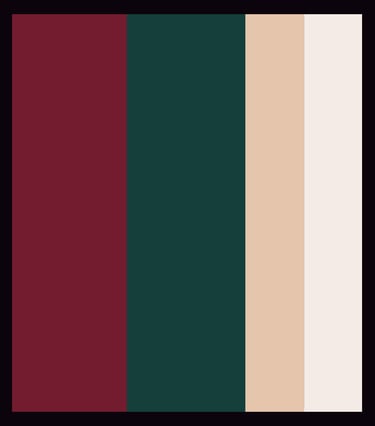
Color Palette


Initial Sketches
Early concepts explored a variety of directions for the Rosey Cricket identity, each one emphasizing different aspects of storytelling and whimsy. One of the earliest concepts used a seal-like shape to evoke the feeling of a wax sealed letter while also including a nod to the D20 shape popular in tabletop gaming. Wildflowers were also explored for an emphasis on the whimsical, and while it was not used for the final design, it did evolve into one of the secondary icon designs for Rosey Cricket. A third concept framed the rose within an archway-inspired form, tying in to architectural elements and ultimately inspiring the cathedral-style framing of the final mark.
These explorations allowed the design to evolve thoughtfully, balancing handcrafted detail with architectural inspiration to arrive at the final identity.


Branding Design
See Other Recent Projects -


Connect
sarah@fellowtravelerdesign.com
© 2026 All rights reserved.